Brand Logo Guidelines
The logo is our most important brand asset. We use it with consistency and intention to represent the world of social discovery to billions of people around the world.
Updated 2025Central Pattana Logo & Usage
The Central Pattana logo exists in two versions: Horizontal and Stacked. Each version has been designed for specific applications to ensure clarity, balance, and brand consistency across all touchpoints. You can download our logo from the link below. It's important you use the current version of the logo. Please use the link below and don’t download a logo from a Google search which may be out of date or incorrect.
Horizontal Logo
Use the horizontal logo in spaces where the logo appears prominently and independently. It should be centered within the design layout whenever possible. This version is best suited for applications where visual clarity and brand presence are the primary focus.

Stack Logo
Use the stacked logo in situations where space is limited, or when the logo is displayed alongside other brand marks (such as partner or sponsor logos). This version maintains legibility and brand impact in compact or multi-logo environments.
LOGO PRIMARY COLOR
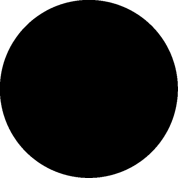
BLACK
Process Black
C0 M0 Y0 K100
R12 G12 B12
HEX #0C0C0C
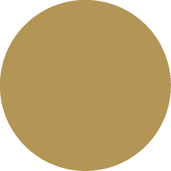
GOLD
PMS 871
C14 M26 Y64 K24
R179 G150 B86
HEX #B39656

WHITE
R255 G255 B255
HEX #FFFFFF
LOGO WATCHOUTS
Our logo is often used in an incorrect way. Please avoid using any of the following examples.
Black / Gold logo
Black / White logo
White / Gold logo
Black / Gold logo
Black / White logo
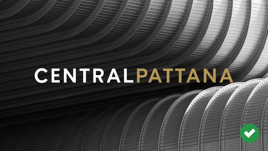
White / Gold logo
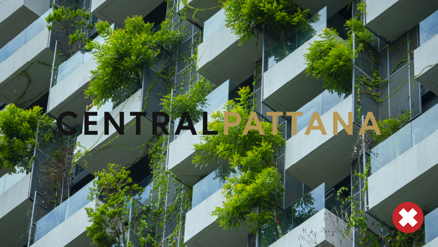
DON’T
Use the logo on complicated images that limit legibility
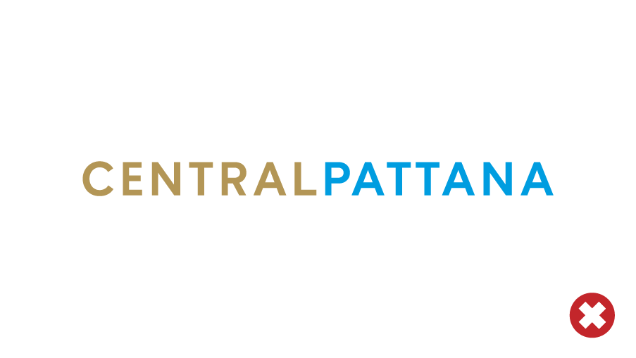
DON’T
Use the logo in another colour
DON’T
Use the logo in another colour
